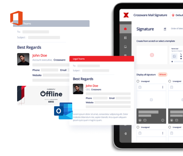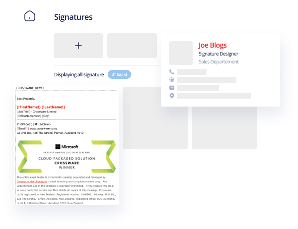
Whether you’re a business or an individual, the benefits of a great email signature should not be ignored. A well designed email signature has the ability to drive huge traffic to your website but also increase your personal or company brand awareness.
I like to look at the email signature as similar to a business card. A lot of time goes into the design of a business card, to ensure it stands out but remains professional. The same process should be used when creating an email signature.
There are a number of different things you need to consider when creating your email signature.

Design and Layout
The design and layout of your signature is perhaps the most important part to consider. The difference between a well designed signature and a poorly designed one could be thousands of clicks and perhaps even sales! The industry in which you work is an important factor to consider when thinking about the design. For example, creative industries will likely have more colour compared to others.
If you are just looking to create a standard professional looking signature, I recommend keeping the design and layout very basic. Three lines of text is enough for a basic email signature.
Henry McIntosh
Marketing Manager, Crossware
+64 9 303 2222
In the example above, I have linked the company name to our website. This gives the recipient at least one way to easily reach your website for more information.
If you\’re feeling brave and want to make your signature standout a bit more, you can experiment with different design features. But remember the golden rule; keep it professional; you would be surprised about the number of crazy looking email signatures that I see from top level business people!
Colour
The colour of your key contact details should be the same colour as the email body text, which is usually black. Not only does this create consistency between the message and your details but it also gives a sense of professionalism.

The colour of any links should be a different colour to the key contact details – this helps them to stand out.
Font
Again, the font type and size of your key contact details should be the same as the body of the email. This consistency means that the message flows easily down to the signature rather than looking like it has just been stamped at the bottom.
Stick to the standard and well used fonts (e.g. Times New Roman, Arial, Trebuchet MS); these will appear the same on most email clients and mobile devices. If you use an obscure font, there is a high chance that it will appear very different when it arrives to the recipient.
Size
Keep it short. People read your emails for the content not the email signature; don’t include your life story. The most effective size of an email signature is about 5 lines, this gives you enough space to include all of your key contact details, some social media icons and perhaps a targeted advertising message. If it is any longer than this, you will likely overload the reader and they simply won’t read any of it.
What NOT to do
Do not use bright colours; you might think it will help you stand out. But it will only make you look immature and unprofessional. As I mentioned above, the number of business people with crazy colours and fonts on their emails is staggering. It is important to remember that the key function of an email signature is to supply people with information about you (contact details etc). Don\’t focus on attracting the attention of the reader; the design should be clean and clear rather than bright and bold.

The biggest no-no regarding the design and layout of your signature is including quotes. Including a funny quote at the bottom of an email to your friends is OK but definitely not on any professional emails.
Social Media
Including social media links on your email signature is very important. Email readers are already online so social media gives them an opportunity to continue a relationship with you/your brand. The email signature effectively bridges the gap between email and social media.
Which links to use
There are two different ways to promote your social media links in your business email signature. If your company is using email signature software, image links are the best option. If you design your signature with images and you are not using email signature software, the reader will have to click ‘display images’ to actually see anything.
1.Text links
Text links is the more basic of the two options. It is not as visually appealing to the reader but you can trust that it will always appear the same. When using text links, make them stand out by making them bold or perhaps a different colour and always underline the link.
Ensure that the alignment of the links looks the same on mobile devices as well, often some links will appear differently on some smartphones, do some testing before finalising anything.
2.Image links
For business email signatures, image links are a lot more effective. But to include them on your mobile emails will require some email signature software, as mentioned previously.
Most companies place their social media images at the bottom of the email, but consider placing them at the top, see mine for example. This means that all of my key contact details are not clouded by social media images.
Size
The size and layout of the images is also very important. If your images are too big, the email will often change layout when read on mobiles, make sure you test it on as many different devices as possible. I recommend using icons 20×20 pixels or smaller.
What NOT to do
Do not include inappropriate social media platforms; this especially applies to business email signatures. It\’s OK to include platforms like Tumblr, Instagram and ask.fm if you are emailing your friends, but certainly not when communicating with anyone else.
The number of social media icons on your business email signature should not be more than 5. If you are active on more than five platforms, choose the 5 that will likely appeal to your email readers the most. Including too many icons will result in a cluttered signature and the will reader not click on any.
Imagery
Images can significantly increase the click-through rate from your email signature but you need to be smart about it. As mentioned previously, if you are not using some sort of email signature software your images will most likely not appear unless the recipient clicks ‘display images’.

One image vs. many
If you include a lot of small images in your email signature, each image will have its own title appearing like the image above for some email clients. To avoid this, consider creating one big image which includes all of your images. This way you will only create one image title.
Advertisements
Including advertisements on every-day emails is a very new feature for email signatures. Most email signature software will allow you to include a banner ad at the bottom of your email signature. These can then be targeted towards groups within your contact database based on country or various other preferences. If you are not using email signature software, place the ad at the very bottom so it will not appear as a blank space.
Before finalising anything, test how your advertisements look on different email clients and mobile devices. The size of any imagery can change how your email appears.
What NOT to do
Do not use images wider than 500 pixels, any bigger than this and the email will become difficult to read on a mobile.
Do not have your entire signature as an image, if the recipient doesn\’t click ‘display images’ they will not see your email signature.
Do not include a QR code. The email reader is already online, use a link!
Legal Disclaimer
The laws surrounding legal disclaimers on emails are tightening all around the world. There are already a number of laws throughout Europe which require companies to include certain details. The penalties for not complying with these laws can result in large fines and even jail time in The Netherlands. I recommend that you include the following in your business legal disclaimer:
- Company name
- Registration number
- Registry location
- Registered office
Conclusion
The power of the email signature is something that individuals and businesses are finally starting to realise. The rise of social media has created a situation where the importance of email has almost been forgotten. The number of emails being sent everyday, still exceeds all social media posts combined.
Having a well designed, professional email signature is hugely beneficial; I hope my tips help you to create your perfect email signature. If you have any questions or other tips regarding email signatures, feel free to comment below.
If you\’re interesting in trying some email signature software for your company email signatures, Crossware offers a free 30 day trial here.


