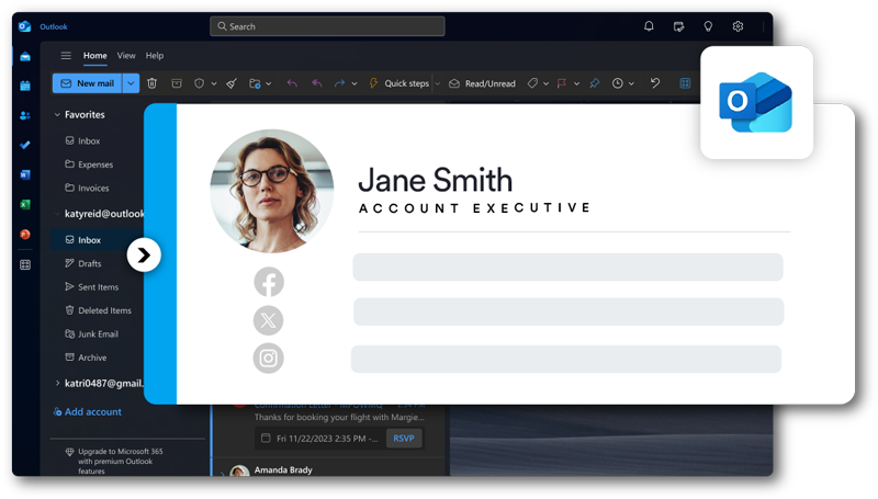
The content that you see below the email body is email signature. Usually, it\’s a closing phrase followed by the company\’s name or sender\’s name. It may also contain the company logo, social media icon, or contact details of the sender. The design of an email signature has changed with time. You can upload graphical text and images to the footer of the email.
The signature design is one of the most powerful marketing tools, and it lets you add a call to action or signature promotion banner. An email signature is the first visual impression you make through the mail.
It can be a channel of the highest ROI marketing. It lets you drive more sales and conversations. In short, it is a critical factor in marketing and sales. A perfect email signature design can grow content marketing and build brand awareness.
Elements of Email Signature Design
An email signature design should have these important elements – Name, Company URL, Contact email, Contact phone, and Job title. You can add these in your email as simple HTML or plain text to represent the mail\’s brand value. Most people add CTA in plain text signatures, but the impact is not that great.
With plain text email, your company may miss significant sales enablement opportunities, affecting your business. If you\’re looking to create an email signature with interactive elements and canvas for expression, consider HTML email signature style. You will need to make sure you use the signature system and not the plugin one.
How to Design Email Signatures?
Having an excellent design for your email signature can get you all the positive attention. It can get you closer to your projected sales goal.
- Signature Colours
If your design is too bright, it won\’t have the impact you\’re hoping for. You need to use soft or subtle colours that don\’t oversaturate the email content. It is best to use two colours or combinations. Red and black look great, or you can stick to white and pink. Do not make the colour look clumsy.
- The design size
Once you consider the colour combination, you will need to choose the design size. The size should be correct and not too big. For horizontal orientation, stick to a ratio of 3:2, and for the vertical direction, you can consider 1:3. It should not exceed more than 50kb. Most people will flag your email as spam if the size is too big. Using an online email signature generator is the best option for getting the size right.
- Height and width
The height of the email signature should be ideally 400 pixels for a horizontal image. For vertical images, the height should not exceed 600 pixels. The width of the signature should not be more than 600 pixels. For mobile optimization, the dimensions are half so that it loads faster.
Guidelines for Banners and Signatures
- Keep it invariable
It would be best if you kept your email banner consistent with your brand. If your branding is informative, keep your email signature design on similar lines. If your brand ethos is highly professional and proficient, make sure that it projects in your email banner.
It means you can keep the design almost similar. If your brand logo uses a specific palette of colours, use the same colours in the email banner. You might want to try out different colour styles and designs, but reaching the right target audience is even more important. The best part is your homepage banner, and email banner can be similar as well to gain maximum benefit.
- Cater to your target
When you design your email signature, all the elements should cater to your audience. Most companies have different email signature styles. A different design for employees and a different one for marketing is what you should consider.
You can customize signature designs and banners according to the call to action. Designing banners according to role and location is also common. You will have to map your signature to the needs of the target audience. Once you\’re clear of the target, it becomes easy to design a signature. Eventually, it is all about increasing your sales and growing your business.
- Don\’t include too much information
Unlike other marketing practices, less is more for email signatures. If you\’re planning an email design with CTA\’s, links, and information, you may not create a positive impact. It would be best if you considered the overall impression that you leave on your reader. If the reader or the recipient of the mail cannot read your message or banner clearly, how will you put your point across?
Don\’t get overwhelmed to provide all the information in the space. Create an email signature banner that gives a fair idea about your company and services in a more specific way. The more you fill up things, the more your email would have a chance of landing in spam.
#Tips for Creating an In-house Email Signature Style
Description of the three-four goals you\’re thinking of should be part of the signature. The design brief should describe the mood, feel and look of the signature. The description of how the email signature banner can integrate with other systems.
You can consider the device as a default design. You need to view all the guidelines for font palette and colour in use. All the factors are essential for the recipients of the mail. Consider specific requirements for the size of the image you use in the email design concept or banner. Create an email banner guide to get good results.
In a nutshell,
A great email signature style should be ultimately brand consistent and straightforward. You need to place all the elements according to the design hierarchy. Add a call to action with the integration of promotional strategy. If you want to promote your social media accounts, integrate with clickable icons.
For a more professional approach, include the space dividers and add calendar appointments. Don\’t forget to make your contact number easy to call from any location. Also, design a mobile-friendly mail signature as most people use mobiles for email access.
[/et_pb_text][/et_pb_column][/et_pb_row][/et_pb_section]